
Top 10 Cool Criterion Collection Covers. The Criterion Collection recently announced it would move its films from Netflix's streaming service to that of its competitor, Hulu. In addition to having rights to many of cinema's most beloved and classic movies, Criterion is also known for its beautifully designed DVD cases. TIME takes a look at some of the company's best work
House (1977)
Bizarre is too paltry a word to describe the insanity that is House. Japanese director Nobuhiko Obayashi's cult horror-comedy sends a group of young girls to an old house in the countryside owned by one of their decrepit aunts. There they discover evil spirits, disembodied heads, carnivorous pianos and one very naughty cat. Before it was available as a Criterion release, House traveled the U.S. as a midnight movie. Nashville designer Sam Smith (who also played drums for pop-rocker Ben Folds) put together this mad, bright orange poster for the film's run at his hometown's Belcourt theater. "I used the first idea that came to me after watching a screener of the film — Blanche the cat's psycho-screaming mug — and adapted it to stand alone as a symbol of the uncanny and over-the-top assault that our midnight-movie audience was in for," wrote Smith. Eventually, Janus Films (the movie's distributor) and the Criterion Collection both adopted the striking image for posters and DVD cases. There's just something about this that says, "Watch me or I will eat you."
Diabolique (1955)
There is a moment near the end of Henri-Georges Clouzot's suspense thriller Diabolique that remains one of the most frightening ever put on film. It's the inverse of a scene that takes place near the beginning — a scene alluded to in this off-kilter Criterion art. We're not giving anything away by saying that film's plot is set in motion when the headmaster of a French boarding school is murdered by his wife and his mistress, who drown him in his bathtub. The red, white and black colors, the skewed angles, the very violence of the image — it all works together in a maximally unsettling fashion.
Make Way for Tomorrow (1937)
It's not like Leo McCarey didn't know how to make a happy movie. After all, as Roger Ebert has pointed out, this was the man who made Duck Soup, the Marx Brothers' best film. Yet Make Way for Tomorrow might be one of the all-time tearjerkers. (Documentary filmmaker Errol Morris once called it "the most depressing movie ever made, providing reassurance that everything will definitely end badly.") A story about an elderly couple who are separated and must shuffle between children after they lose their house during the Depression, Make Way deserves the beautifully muted palette of the cartoonist who goes by the name of Seth. Just looking at this art — everything about the posture of those two indicates that they know they'll never see each other again — makes one want to start sobbing.
The Great Dictator (1940)
Hitler pretty much killed the chance of anyone ever wearing the under-the-nose mustache again. But before Adolf, there was the Little Tramp, who had sported almost identical facial hair. And though Charlie Chaplin retired the iconic character years earlier, he took advantage of his resemblance to Hitler to skewer both the Nazi and his former alter ego in The Great Dictator. This cover art cleverly does the same, using the mustache at the center point for depictions of both the bowler-hatted Tramp and the side-parted Hitler. One can flip the DVD case to properly see the other perspective.
The Seventh Seal (1957)
Even if you haven't seen this film, you know of its most famous scene, the one in which Death plays a knight recently returned from the Crusades in an seaside chess match. The plague has ravaged the land. Yet as long as the game continues, the knight can remain alive. It doesn't really matter, though, because Death always wins in the end, doesn't he? This Criterion cover — simple, stark — conveys that same truth with nothing but light and shadow. The face of Max von Sydow, who plays the knight, is slowly disappearing into darkness. One could also interpret the image in reverse, by saying that his face is emerging into the light. If that is the case, though, it's a pitifully small light. The meaning remains the same.
Shock Corridor (1963)
When Martin Scorsese's Shutter Island was released in early 2010, many critics compared it to Samuel Fuller's film about an ambitious reporter who feigns insanity in order to gain access to the inner workings of a mental hospital. As crazy and overheated as Shutter Island was, it has nothing on Shock Corridor, a trippy journey through the psychological, racial and sexual hang-ups of the early 1960s. Daniel Clowes, the artist and screenwriter behind Ghost World, provided the lurid art for this Criterion release. (He also illustrated the cover for Fuller's The Naked Kiss.) It seems to imply that the film's only reality, its most colorful moments, are those that take place in the asylum and those that take place in the mind. Everything else is just boring black and white.
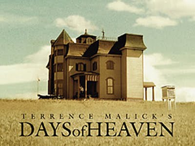
Days of Heaven (1978)
As with all of Terrence Malick's films, from Badlands to The Thin Red Line to The New World, Days of Heaven is praised for its lyrical visuals. It's only appropriate that a still from this film should be used as its cover image. A sole blurry figure, gorgeous golden fields of wheat, a towering Victorian mansion and dim blue skies — the eye is drawn slowly upward to the heavens.
Pierrot le Fou (1965)
It's hard to get away from the Jean-Luc Godard maxim that goes, "All you need for a movie is a girl and a gun." It's all right there in this image from the director's mid-'60s on-the-run flick starring wife Anna Karina and Breathless star Jean-Paul Belmondo. There's an extremely pleasing symmetry to the design of this cover, from the bunching of the bodies on the right to the negative space on the left to the coloration that is repeated on both halves of the frame. The whole thing is clean and cool and stylish and feels as hip as something from '60s France should.
The Royal Tenenbaums (2001)
Attention to detail must run in the Anderson family. Much like the production design for each of Wes Anderson's films, the art of Eric Chase Anderson is full of tiny, almost imperceptible, grace notes. Eric, who drew each of his brother's Criterion Collection covers except for that of Bottle Rocket, delivers his best work here. Between the florid script of the film title (reminiscent of a young Tenenbaum learning how to write cursive), the pretentious pink shock of the Tenenbaum flag and the general melancholy, wintry feel, Eric Chase Anderson perfectly captures the film's tone.
Modern Times (1936)
It was Chaplin's last run as the Little Tramp. One of the film's major themes, humanity against impersonal industry, is simply and jauntily conveyed here by giving Chaplin cogs for eyes. The image is also a nod to Modern Times' memorable sequence in which the Tramp is almost digested by the gears of a giant machine.
[Top 10 Cool Criterion Collection Covers article from Time]
House (1977)
Bizarre is too paltry a word to describe the insanity that is House. Japanese director Nobuhiko Obayashi's cult horror-comedy sends a group of young girls to an old house in the countryside owned by one of their decrepit aunts. There they discover evil spirits, disembodied heads, carnivorous pianos and one very naughty cat. Before it was available as a Criterion release, House traveled the U.S. as a midnight movie. Nashville designer Sam Smith (who also played drums for pop-rocker Ben Folds) put together this mad, bright orange poster for the film's run at his hometown's Belcourt theater. "I used the first idea that came to me after watching a screener of the film — Blanche the cat's psycho-screaming mug — and adapted it to stand alone as a symbol of the uncanny and over-the-top assault that our midnight-movie audience was in for," wrote Smith. Eventually, Janus Films (the movie's distributor) and the Criterion Collection both adopted the striking image for posters and DVD cases. There's just something about this that says, "Watch me or I will eat you."
Diabolique (1955)
There is a moment near the end of Henri-Georges Clouzot's suspense thriller Diabolique that remains one of the most frightening ever put on film. It's the inverse of a scene that takes place near the beginning — a scene alluded to in this off-kilter Criterion art. We're not giving anything away by saying that film's plot is set in motion when the headmaster of a French boarding school is murdered by his wife and his mistress, who drown him in his bathtub. The red, white and black colors, the skewed angles, the very violence of the image — it all works together in a maximally unsettling fashion.
Make Way for Tomorrow (1937)
It's not like Leo McCarey didn't know how to make a happy movie. After all, as Roger Ebert has pointed out, this was the man who made Duck Soup, the Marx Brothers' best film. Yet Make Way for Tomorrow might be one of the all-time tearjerkers. (Documentary filmmaker Errol Morris once called it "the most depressing movie ever made, providing reassurance that everything will definitely end badly.") A story about an elderly couple who are separated and must shuffle between children after they lose their house during the Depression, Make Way deserves the beautifully muted palette of the cartoonist who goes by the name of Seth. Just looking at this art — everything about the posture of those two indicates that they know they'll never see each other again — makes one want to start sobbing.
The Great Dictator (1940)
Hitler pretty much killed the chance of anyone ever wearing the under-the-nose mustache again. But before Adolf, there was the Little Tramp, who had sported almost identical facial hair. And though Charlie Chaplin retired the iconic character years earlier, he took advantage of his resemblance to Hitler to skewer both the Nazi and his former alter ego in The Great Dictator. This cover art cleverly does the same, using the mustache at the center point for depictions of both the bowler-hatted Tramp and the side-parted Hitler. One can flip the DVD case to properly see the other perspective.
The Seventh Seal (1957)
Even if you haven't seen this film, you know of its most famous scene, the one in which Death plays a knight recently returned from the Crusades in an seaside chess match. The plague has ravaged the land. Yet as long as the game continues, the knight can remain alive. It doesn't really matter, though, because Death always wins in the end, doesn't he? This Criterion cover — simple, stark — conveys that same truth with nothing but light and shadow. The face of Max von Sydow, who plays the knight, is slowly disappearing into darkness. One could also interpret the image in reverse, by saying that his face is emerging into the light. If that is the case, though, it's a pitifully small light. The meaning remains the same.
Shock Corridor (1963)
When Martin Scorsese's Shutter Island was released in early 2010, many critics compared it to Samuel Fuller's film about an ambitious reporter who feigns insanity in order to gain access to the inner workings of a mental hospital. As crazy and overheated as Shutter Island was, it has nothing on Shock Corridor, a trippy journey through the psychological, racial and sexual hang-ups of the early 1960s. Daniel Clowes, the artist and screenwriter behind Ghost World, provided the lurid art for this Criterion release. (He also illustrated the cover for Fuller's The Naked Kiss.) It seems to imply that the film's only reality, its most colorful moments, are those that take place in the asylum and those that take place in the mind. Everything else is just boring black and white.
Days of Heaven (1978)
As with all of Terrence Malick's films, from Badlands to The Thin Red Line to The New World, Days of Heaven is praised for its lyrical visuals. It's only appropriate that a still from this film should be used as its cover image. A sole blurry figure, gorgeous golden fields of wheat, a towering Victorian mansion and dim blue skies — the eye is drawn slowly upward to the heavens.
Pierrot le Fou (1965)
It's hard to get away from the Jean-Luc Godard maxim that goes, "All you need for a movie is a girl and a gun." It's all right there in this image from the director's mid-'60s on-the-run flick starring wife Anna Karina and Breathless star Jean-Paul Belmondo. There's an extremely pleasing symmetry to the design of this cover, from the bunching of the bodies on the right to the negative space on the left to the coloration that is repeated on both halves of the frame. The whole thing is clean and cool and stylish and feels as hip as something from '60s France should.
The Royal Tenenbaums (2001)
Attention to detail must run in the Anderson family. Much like the production design for each of Wes Anderson's films, the art of Eric Chase Anderson is full of tiny, almost imperceptible, grace notes. Eric, who drew each of his brother's Criterion Collection covers except for that of Bottle Rocket, delivers his best work here. Between the florid script of the film title (reminiscent of a young Tenenbaum learning how to write cursive), the pretentious pink shock of the Tenenbaum flag and the general melancholy, wintry feel, Eric Chase Anderson perfectly captures the film's tone.
Modern Times (1936)
It was Chaplin's last run as the Little Tramp. One of the film's major themes, humanity against impersonal industry, is simply and jauntily conveyed here by giving Chaplin cogs for eyes. The image is also a nod to Modern Times' memorable sequence in which the Tramp is almost digested by the gears of a giant machine.
[Top 10 Cool Criterion Collection Covers article from Time]


No comments:
Post a Comment